
Shipped SaaS
Three products. Three industries. One designer end to end.
These projects span healthcare, manufacturing, and telecom — each with its own constraints, users, and stakes. Across all three, I held sole ownership of the design process: from discovery and problem framing through to interaction design, delivery, and iteration. Every decision was made with a clear line of sight to a business outcome.
Project 01 — Healthcare
IVF Lab Environment Monitoring
Problem
Clinicians couldn't correlate alerts with environmental data, leading to cognitive overload during incident investigation and delayed risk response.
Approach
Restructured alert flows to surface preceding sensor context alongside triggered alerts. Designed a multi-room overview dashboard, device management screen, and individual sensor detail pages with live readings, trends, and alert history — all within reduced navigation depth.
Outcome
Faster incident response and reduced screen-switching improved task completion rates, driving daily engagement and clinical staff retention. Demonstrated risk mitigation supported adoption growth across new clinic accounts.

Dashboard optimized to scan for alerts, across various locations in a clinic.


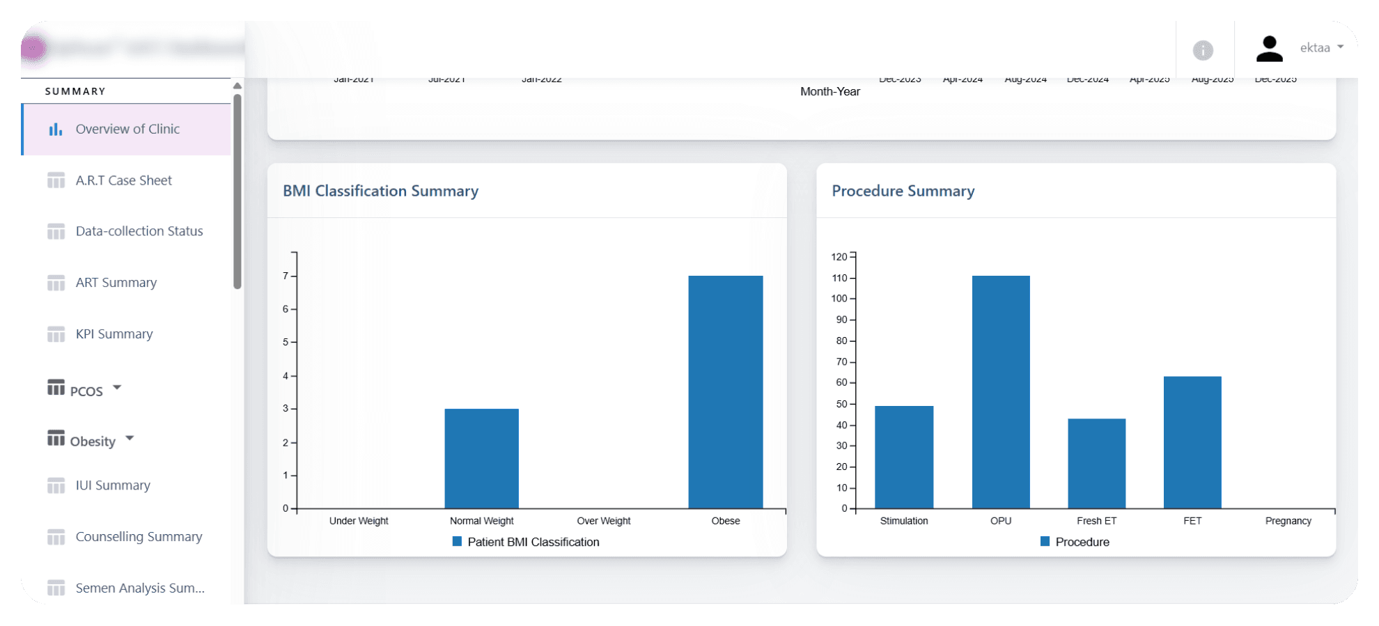
Data restructured to improve understanding of all lab sensors, optimized table action item intuitiveness.
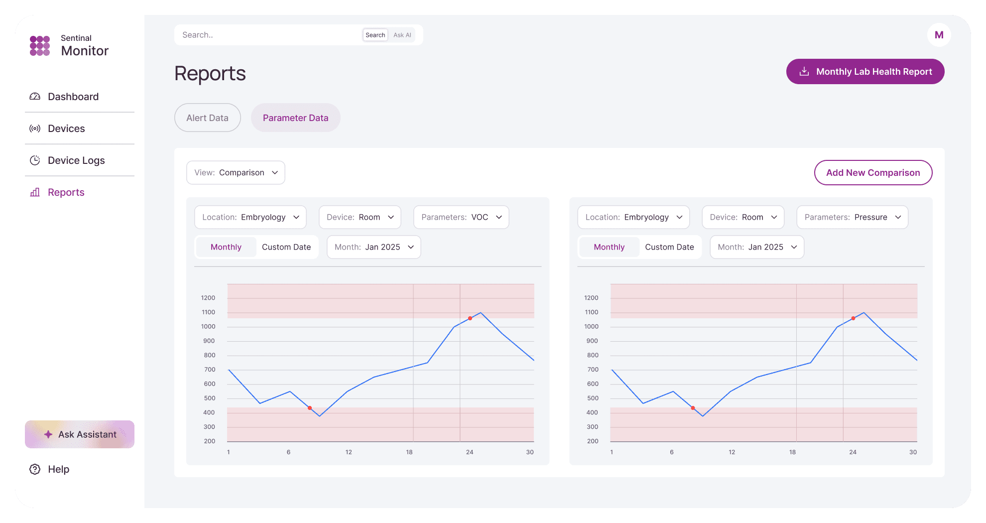
Reports are optimized to make it easy for clinicians to view lab trends and anomalies.
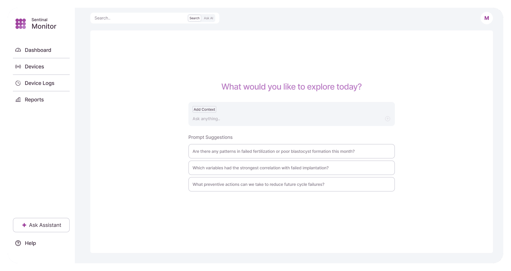
Basic AI-based text generation screen, with template questions to prompt the user.
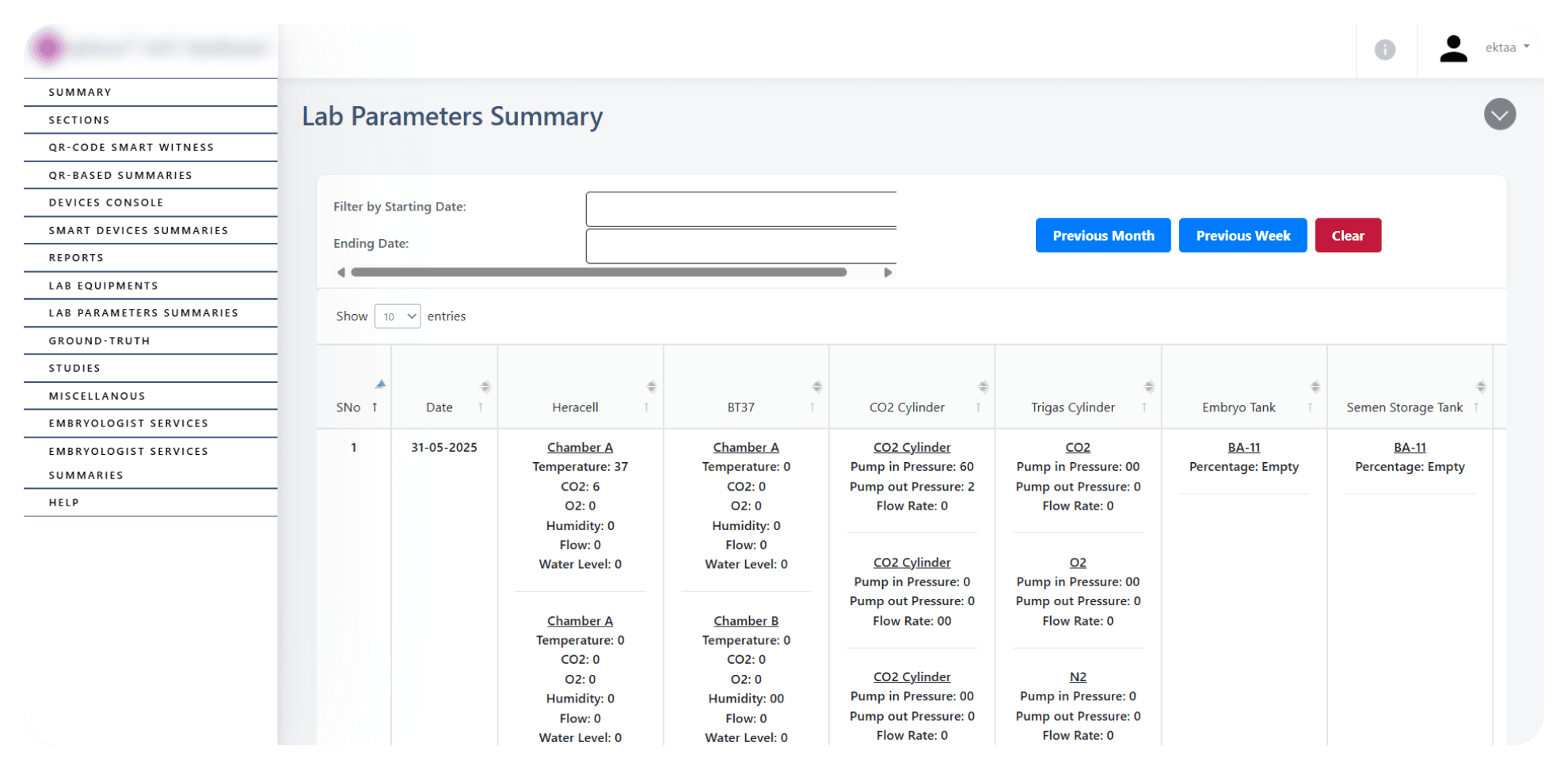

Restructured data structure to view continuous data stream from lab sensors, with toggle switch to only view alert logs.


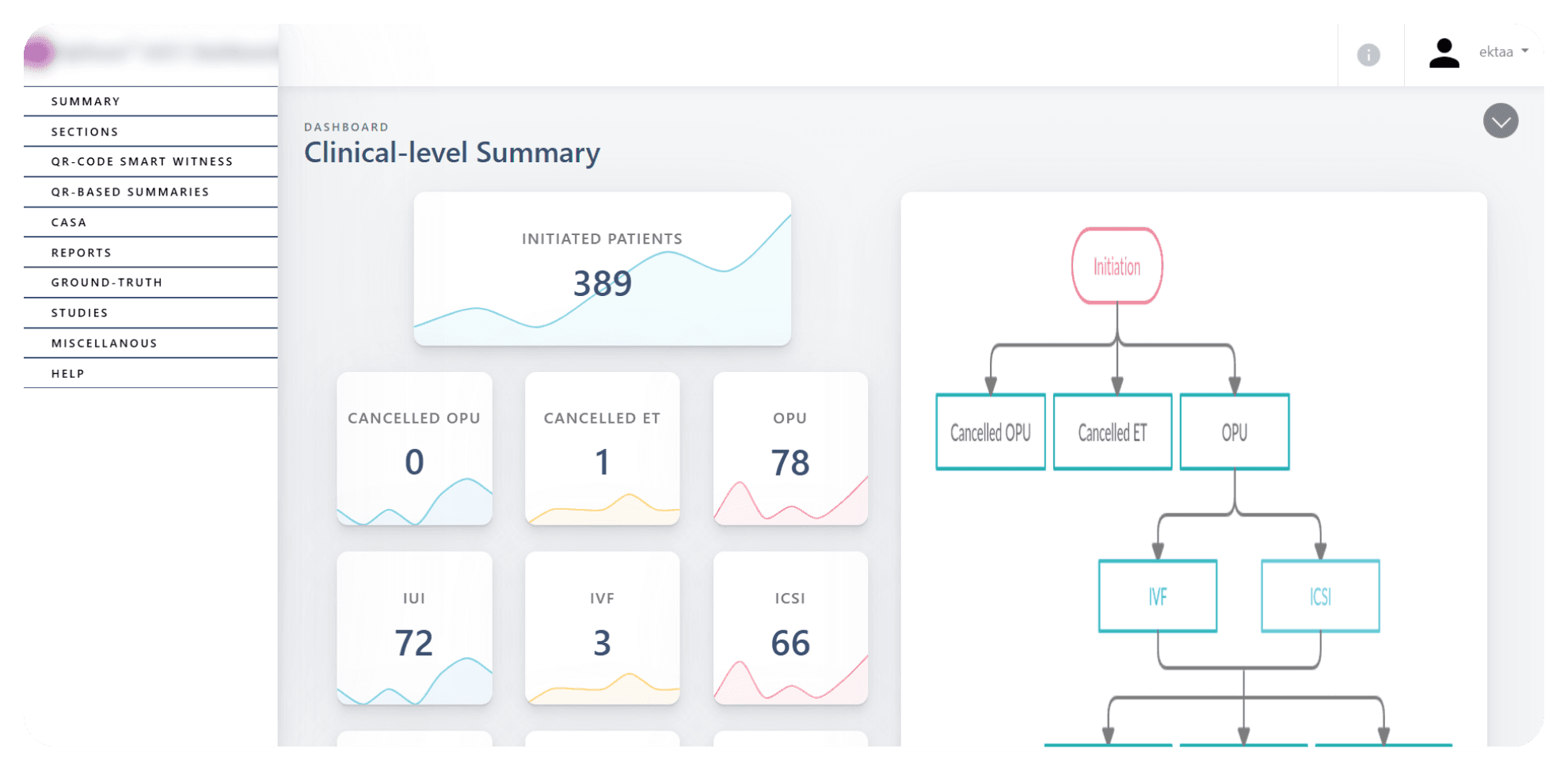
Core layout that enables clinicians to rapidly mitigate risk and identify causes of failure by viewing alerts and device logs before and after alerts.
Project 02 — Manufacturing
Shopfloor Operations Platform
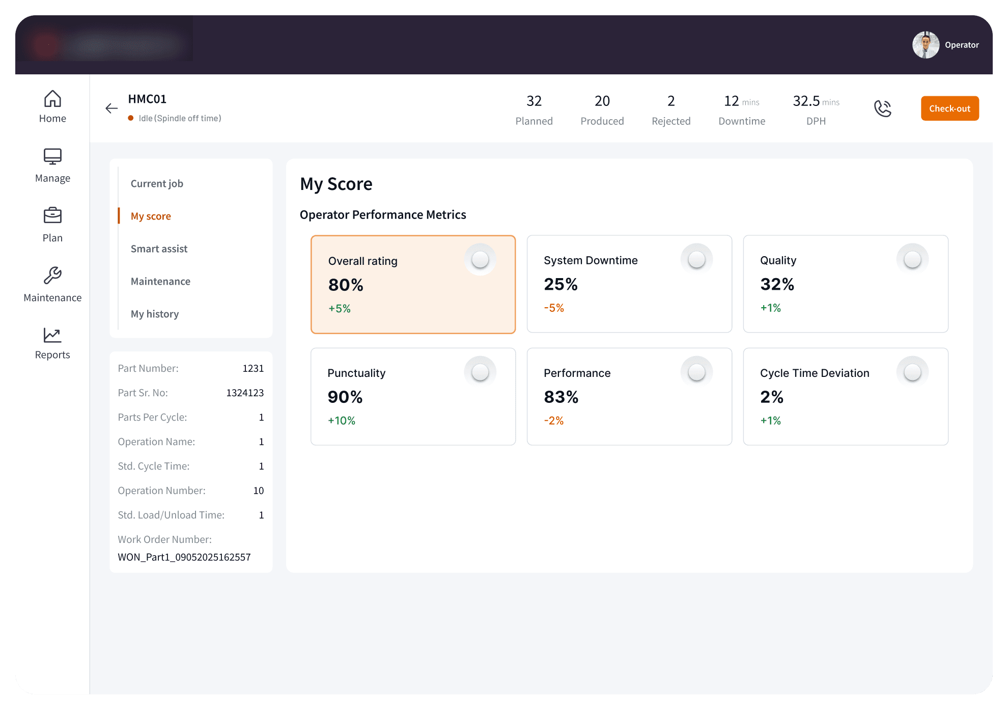
Problem
Operators and supervisors couldn't quickly understand machine status or prioritize actions because the interface lacked visual hierarchy, the design system wasn't confidence-inspiring, and the experience wasn't optimized for 8-inch tablets in harsh shopfloor conditions.
Approach
Rebuilt the design system with clear primary, secondary, and tertiary action hierarchy. Designed a dashboard with customizable machine status cards, role-specific views for operators, supervisors, and managers, and dark/light modes optimized for tablet use in low-visibility conditions.
Outcome
Improved visual hierarchy and task clarity increased daily active engagement across roles. A confidence-inspiring, tablet-optimized interface strengthened retention and drove operational adoption.
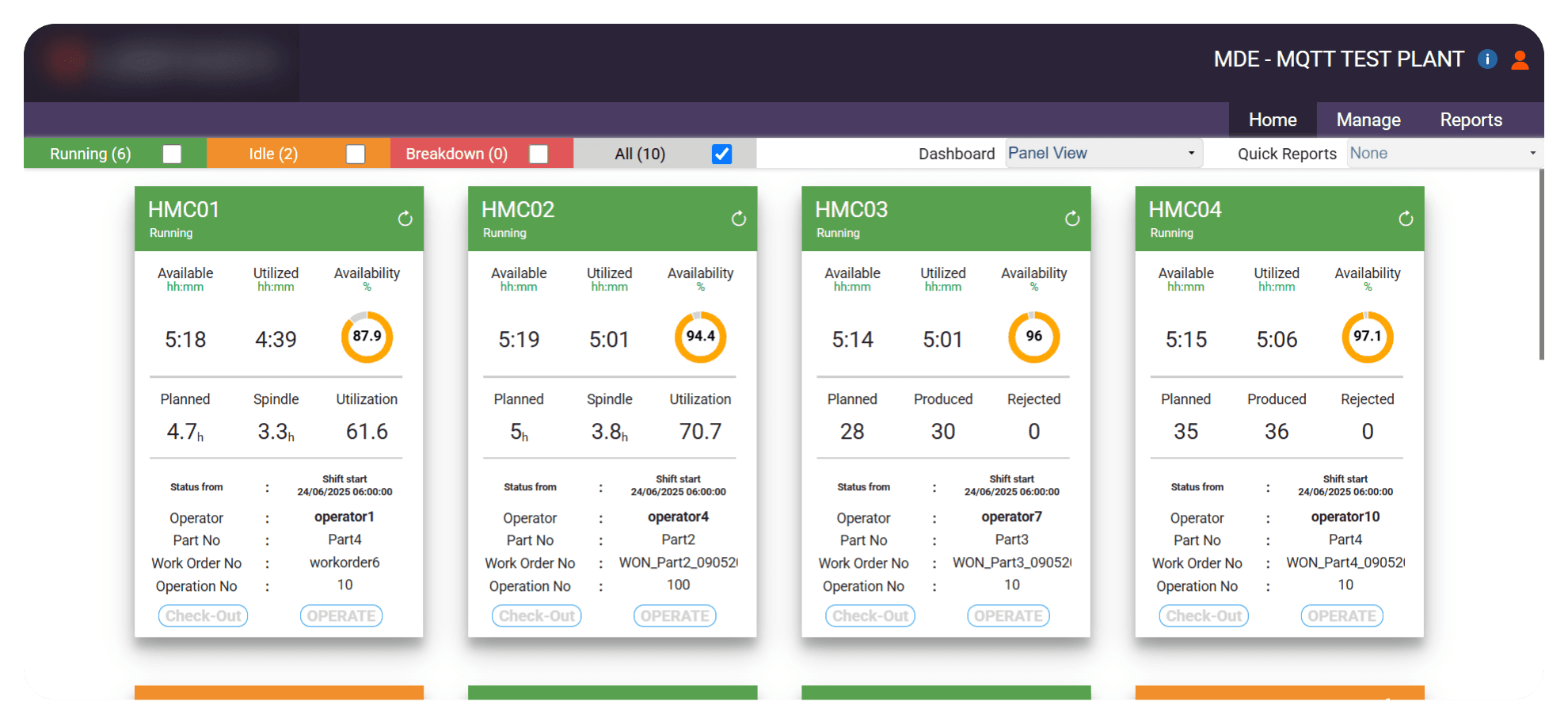

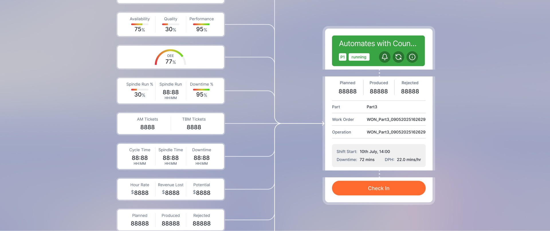
Machine panel cards optimized for reducing cognitive load with customizable data templates and button hierarchy.

Reducing clutter through established function hierarchy through buttons, condensed job status panel to increase active screen space.
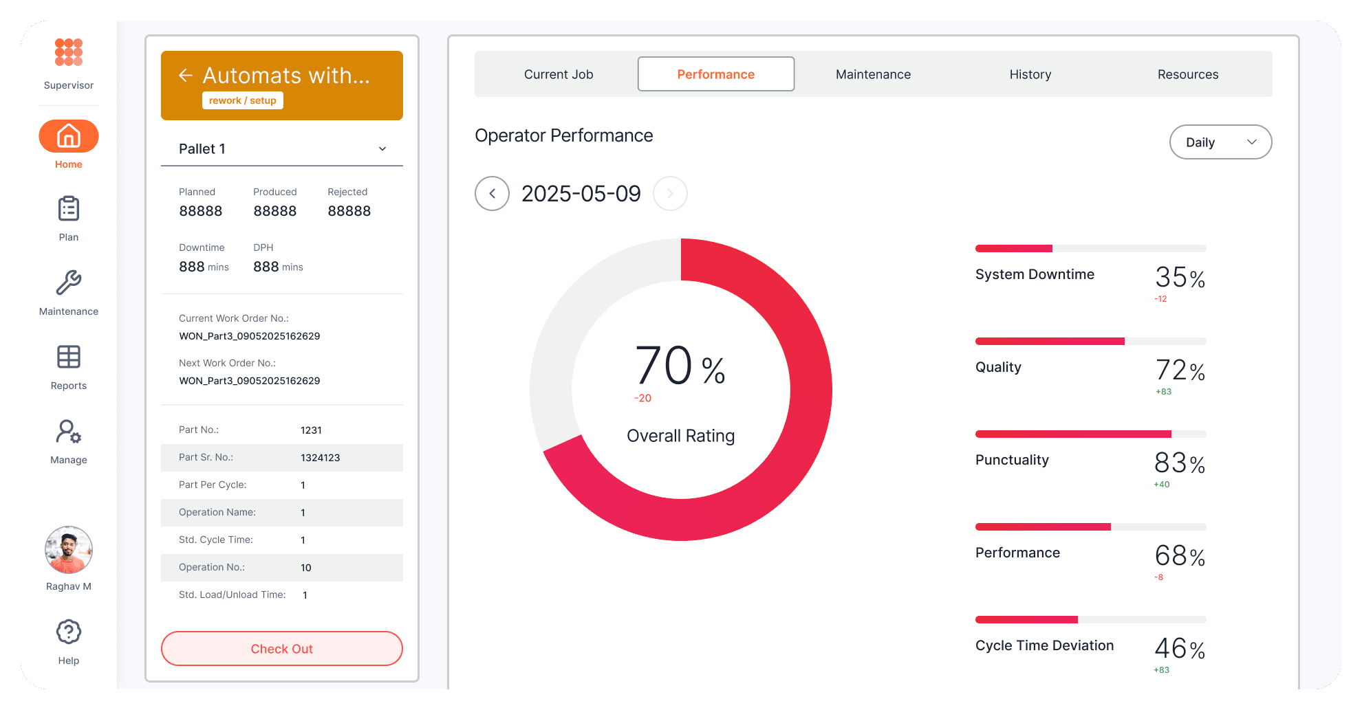
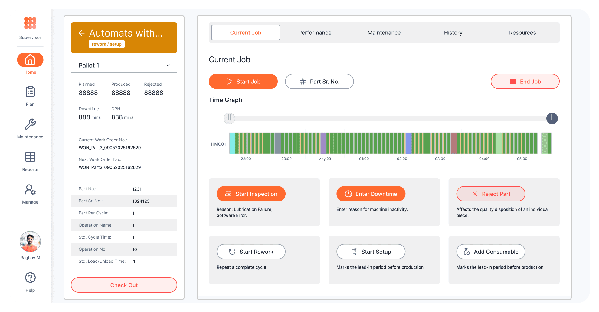
Improving scanability through data visualizations.

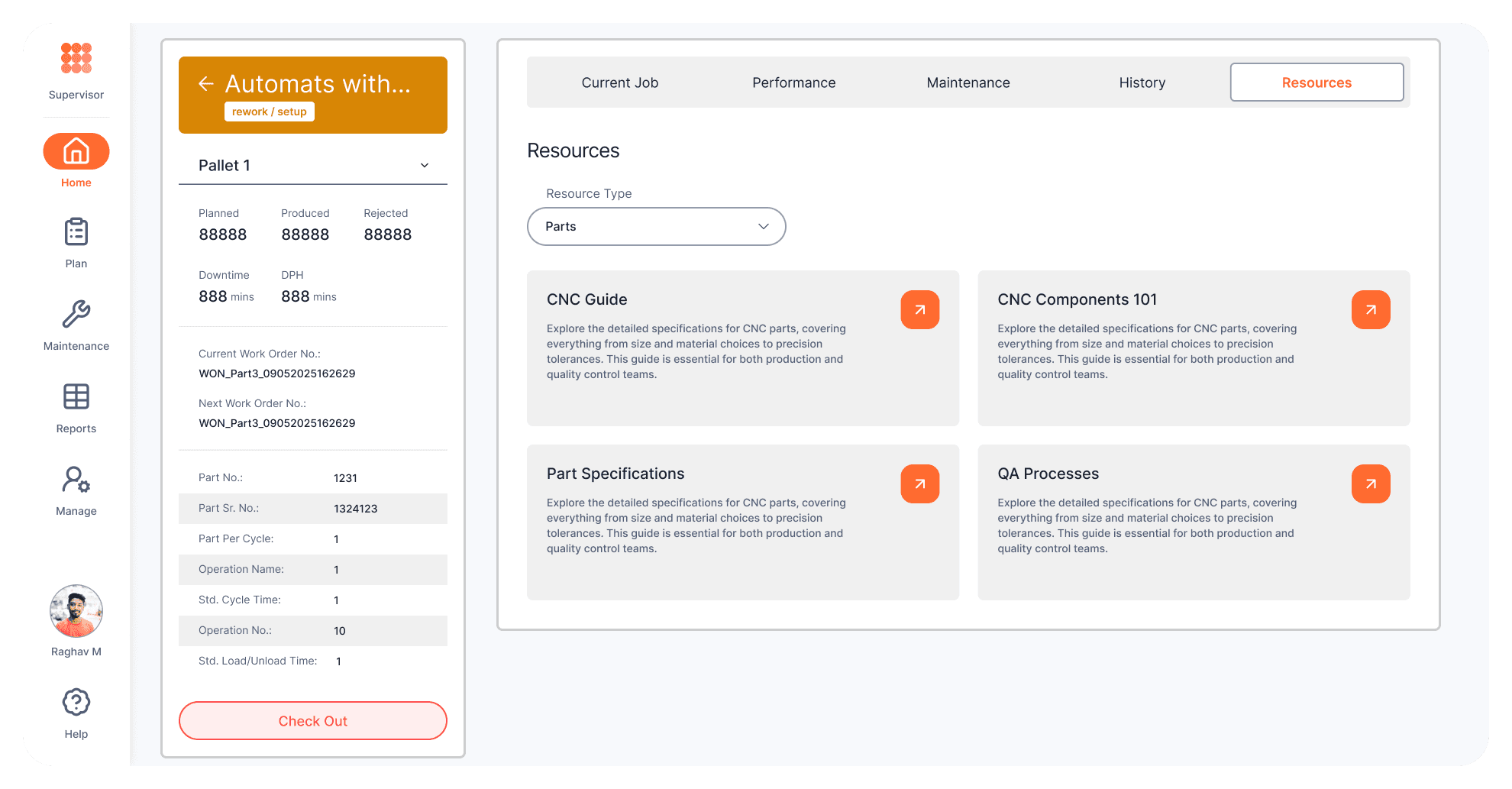
Reworking document hub for clean and clear interactions.

Improving navigation intuitiveness through integrated navbars, redcing clutter in tables and improving visibility of table action items.
Customizable data templates for machine panel structure.
Project 03 — Telecom
EMM Configuration Platform
Problem
IT admins faced an overloaded, form-heavy policy configuration flow with no visual hierarchy, a cramped modal-based editing experience, and an inconsistent design system across the platform.
Approach
Introduced progressive disclosure by grouping configuration options into expandable sections. Moved policy component editing from a modal to a full dedicated screen. Added a collapsible nav to reclaim screen real estate. Refreshed the full design system with consistent button, text, and modal hierarchy. Delivered a mobile version and white-label color customization for client branding.
Outcome
Reduced cognitive load in policy configuration increased admin task efficiency and engagement. A cohesive, intuitive interface improved administrator retention and accelerated onboarding, supporting product growth through faster time-to-value for enterprise clients.


Improving visibility and categorization of data, improving brand identity by using brand colours within data visualization,
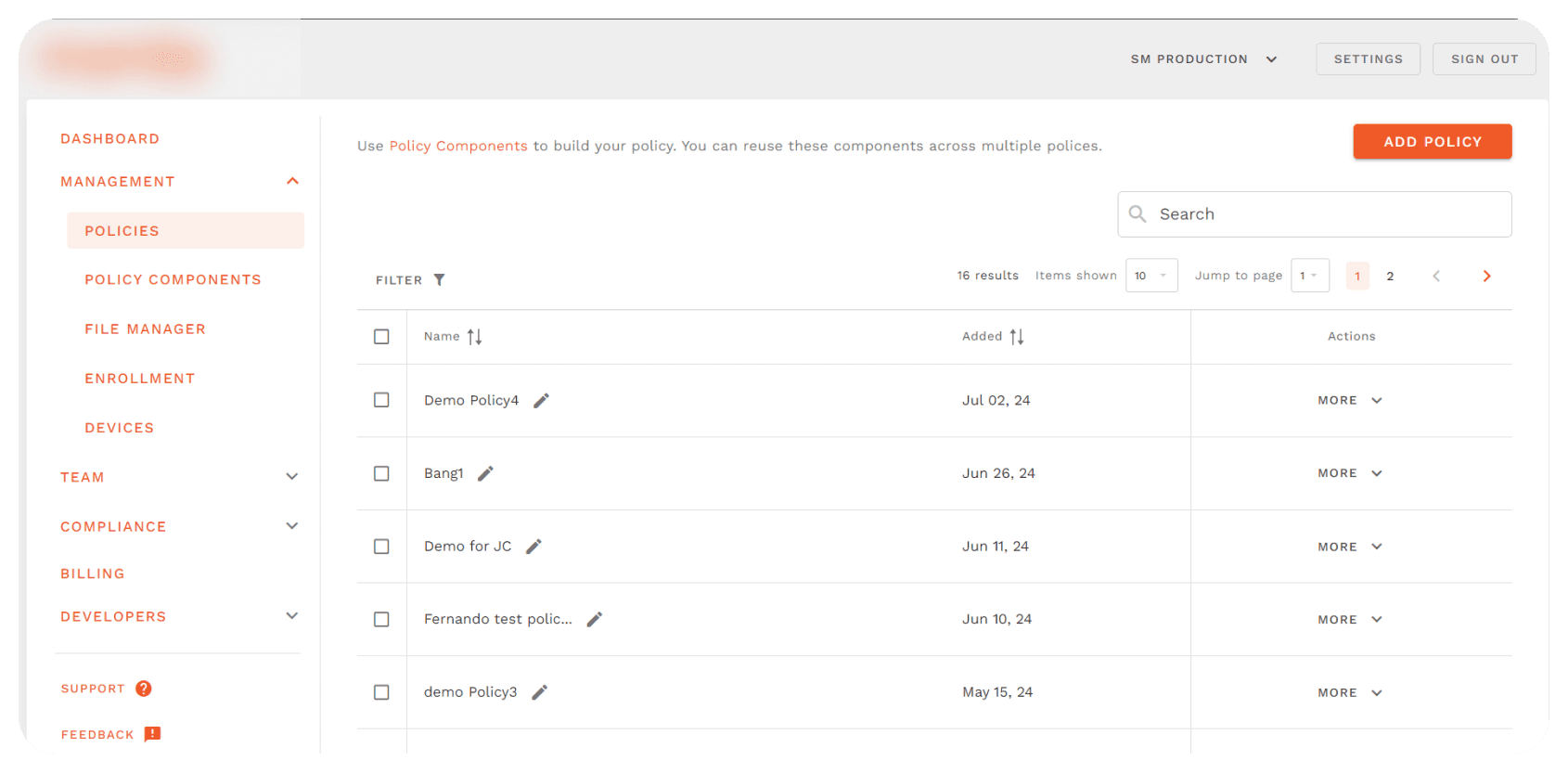

Compressing table actions to give the table more screen space to improve inter-row spacing, better visibility given to table action items.
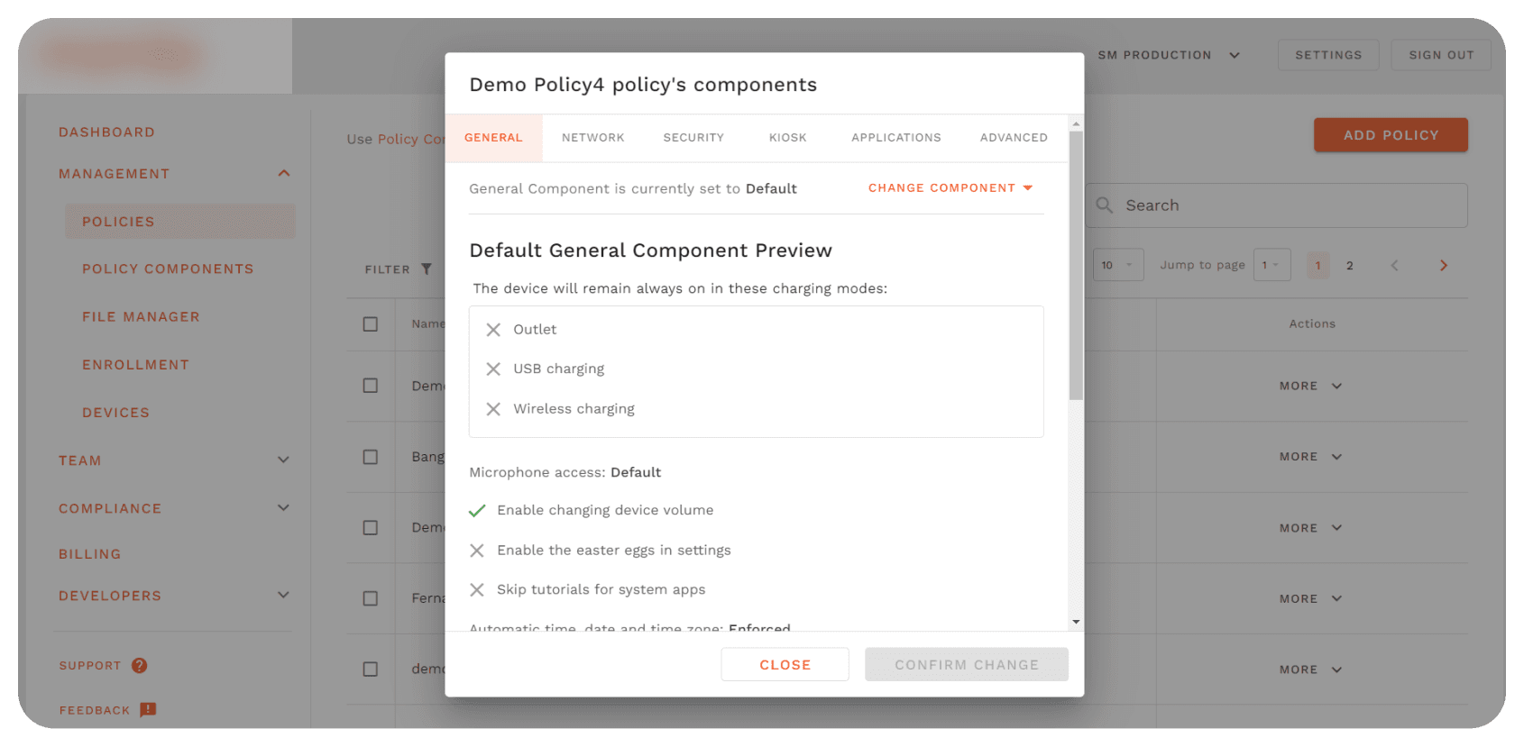

Transforming complex data viewing modal to full screen, with clear categorization and progressive disclosure to reduce cognitive overload.
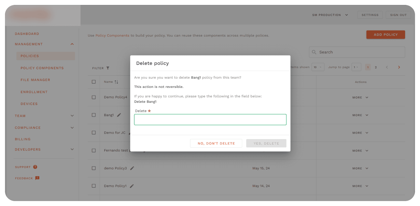

Setting clear ux copy for destructive actions, enhancing visual cleanliness through dynamic spacing system.
